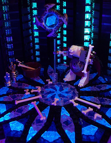
I made a model of a bear divining the future with bones.
It's no secret that my true love is geometric mosaics, and I put them in MOCs mostly just to show them off in a more interesting way (and to show that they could be useful for other builders, too, I suppose).
Here is the mosaic in a different picture all by itself:
I felt inspired to write up a step-by-step description of how I came up with this on flickr, and I would like to expand on it here just a little:
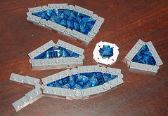
I started with the idea of using curved walls, straight walls, and hinges to make different shapes that could be filled with cheese slopes. Here are some of the shapes I tried first:
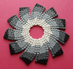
The first mosaic I made with one of these shapes was this flower petal study:
I tried it again, trying to blend the colors from white to black a bit more:
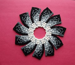
After that, I moved on to trying out another of those original shapes. I first tried the skinny petals all the way around to make a flower, and tried connecting it around the outside, too. However, the outside framing was too tight, and the whole frame came up on the outsides like a bowl.
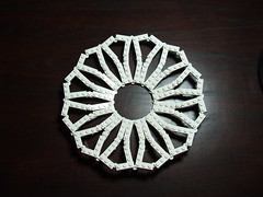
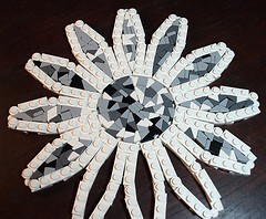
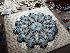
So I took the outside frame off, and just concentrated on filling the center and the petals with cheeses and tiles. I probably found four ways to do the center (only one is pictured). Each petal was filled in a different way, to see which would turn out the best. Some turned out better than others. An ideal filling would not only have the space completely covered, but would also have some symmetry or interesting geometric shaping in the patterns of the cheese slopes, for making interesting color designs with.
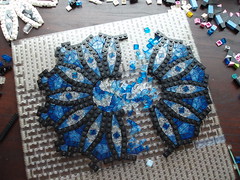
I picked the designs I thought would work the best, and tried them out. Then I tried again to make an outer frame all the way around the petals. I found a way that you can see on the right side of the below picture, but I wanted to make it a little cooler looking. So I added little nubs that stuck out like a snowflake. But that new attempt was too tight, and after I got to about 9 of them done, the plates and hinges that make up the center circle couldn't handle the tension and one of them popped apart. The inner circle wasn't all connected together anymore, though you can't really tell from the photo:
I think at that point I started to take the nubs off, because they couldn't handle the tension. And then this happened:
The frame for the innermost circle burst apart at two places. Very clearly my frame was not working. So I went back to the simpler and less interesting frame, so that the tension on the inside of the mosaic remained at tolerable levels. And in the meantime, I had a good excuse to redo the middle circle to a colored design that I liked better.
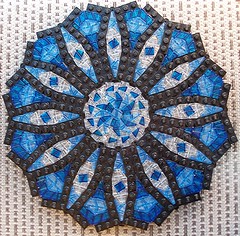 |
| (Sorry it's not the best photograph of the mosaic -- I didn't think to take a better one, since I wasn't done with the whole MOC yet.) |
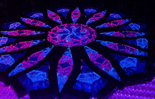
Then I started working with lights. My kids have little lamps with red and blue lightbulbs, and we have 4 blacklights (which make the trans-medium blue cheese slopes glow).
For the final MOC I did a lot of work on the walls, putting double layers of black and double layers of trans for the windows, so that gaps wouldn't show through. It was also tricky to do the walls because the corners of the design were too tight, so I couldn't connect the sections at the bottom, but interlaced them. I layered tiles at the junctions, kind of like interlacing your fingers. By the time I got to the top there was enough give that I could connect all the wall panels together. That really helped with the stability.
For the final lighting, I had two black lights underneath, one on each side right next to the MOC, a blue light in the back, a reddish light sort of shining in the vicinity, a light on in the nearby closet, and then waved a flashlight on the bear's head to try to fill it in with light. It was hard to hold the camera still for the long exposure while holding the flashlight. It took forever to get something passable, and I'm not sure it's as good as I was hoping for, but it works, I guess:
I took some photos with more red in them, which I liked, but it didn't feel as cold as a mystical polar bear place should feel.
(I realize there is a slight inconsistency with this story versus the one I told on flickr. I thought more about how I did the outside frame and made some changes to the order of events. Don't hold it against me in a court of law, please!)
It was fun to work on a project with friends, and it's always great to have a reason to make another cheesy mosaic. ;-D



No comments:
Post a Comment