 |
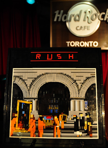
| Moving Pictures, by Isaac Mazer |
When I saw this the first time, I honestly thought it was a 3-D model. The sense of perspective is so amazing I couldn't believe that it was flat. But -- it's pretty flat. Simon tells me it's 40x40 and 3 bricks tall. Isaac has used all sorts of different (and crazy) techniques to get this image into such a small space. If you go to the image on flickr, right click on it, and then hit "all sizes", you can zoom up really close to see all the magic. Some obvious things are the arches and the round pieces for columns. But if you look closely, there is a really great use of gaps as shadows, gaps which help to make the image seem more three-dimensional than it actually is. And the occasional studs that are showing (in the gaps) help to give the picture more detail. I also love the clever details, such as the door handles behind windows in the center doors.
At my presentation on cheese slope mosaics at BrickCon I had a section about eliminating gaps in your mosaics. Then we looked at Paul's mosaic from Atlantis, and talked about how the gaps actually seemed like another color, and added to the whole design. In the case of Isaac's mosaic, that is definitely the case.
This mosaic was part of ToroLUG's show at the Hard Rock Cafe, just like Isaac's Dark Side of the Moon album cover.

No comments:
Post a Comment